Poster
Analysis
A
Nightmare on Elm Street
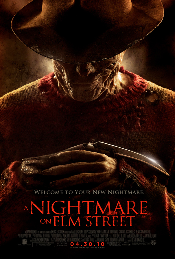
From the first glance at this poster it is
obvious this movie is a horror. From the dark red tones to the tip of the blade
for a finger glaring in the light. The entirety of the page is taken up by one malevolent
figure, despite only being able to see his hands, shoulders and half of his
face, this does not make the figure any less disturbing. In fact, you could say
the sense of mystery portrayed from only being able to see half of his face
adds to the overall frightening feel of the image. The reason this figure takes
up the whole page is to intimidate the audience and make them feel uncomfortable
as they are forced to stare at this one image, because it is the only thing
they can build ideas about the movie upon.
The figure at the front is recognisably the
villain in the movie and as the audience you are supposed to fear him. Even
just from the image he comes across as particularly frightening especially due
to the significant burn marks across his face and hands, his jumper also
appears to have been melted and burnt holes in. The lumps and chunks missing
from the figure’s face trigger ideas that he has been in some sort of accident
or a very aggressive fight, however he is still alive after whatever happened
to him which almost gives the figure a sense of immortality, adding to the
chilling feel this character gives off.
The hat in the picture is used to add mystery and
suspense to the character, it gives the impression he is almost trying to
conceal himself among normal people so he doesn’t come across as different or
stand out. He is planning to be hidden in crowds so he can go unnoticed. This
reinstates the idea of him being creepy and fearsome. The overall tone of the
poster is very dark and gloomy almost difficult to see some things which I
believe is done purposefully in order to keep the audience guessing and
interested so they don’t give too much away. This dark and gloomy setting
conforms to the conventional elements of a horror movie, as do the abnormal
burn marks and the blade for a finger.
The lighting is placed tactfully to add to the
suspense of the poster. For example there is light shining from behind him down
on his shoulders and the back of his neck, it looks almost like steam coming
off from the back of his neck which also creates a sense of burning and pain
and ties in well with the burn marks across the figure’s cheeks. Also, the
light that reflects off the blade is there to make the blade stick out and be prominent
within the image, despite all the other aspects there are to focus on.
The slogan written above the title, “Welcome to
your new nightmare.” Is brilliant for making the audience feel creeped out and
anxious for what’s to come. This removes any doubts you might have of this
movie being anything but horror as the slogan is obviously put there with the
intention to make the audience feel uncomfortable. The way it is welcoming you
into a nightmare makes the audience feel as if they are unable to escape this
nightmare and just by reading the poster they have been forced into it. The
font used for this slogan and the title also creates a rather spine-chilling
image and adds to the overall effect the poster is trying to depict.
The target audience for A Nightmare on Elm Street
is definitely those who love to feel the tension and suspense in certain scenes
as well as the action and drama that is involved once that tensional atmosphere
has been shattered. This movie is obviously not aimed for young children and
their families, it is a much more mature movie and is not appropriate for
children as it is supposed to scare adults so the effect it would have on
children would be vast in comparison.
No comments:
Post a Comment